

Want to know how to get more enquiries from care websites? Lack of enquiries is one of the most common issues care business owners bring to us. The website is live, it looks professional, yet the phone isn’t ringing.
It’s not always about more traffic or a bigger budget. More often, it comes down to whether the website you already have is actively guiding families toward getting in touch, or passively presenting information and hoping for the best.
In this guide, we’ll walk you through what it actually takes to build a care website design that converts, from the first impression to the trust signals and content that give them the confidence to reach out.
Is your care website holding you back? Reach out to our team at Care Connect for expert digital marketing support that really converts.

What ‘Converting’ Actually Means for a Care Website
In most industries, a website conversion is straightforward: someone buys a product, signs up for a service, or books an appointment. In care, it’s different.
A conversion is the moment a family feels confident enough to reach out by making a phone call, submitting an enquiry form, or starting a live chat. It’s not a transaction. It’s a decision that often follows days or weeks of research, comparison, and emotional deliberation.
That distinction matters because it changes what a care website needs to do. It’s not enough to attract visitors. The website needs to hold them, reassure them, and make reaching out feel like the natural next step.
According to one recent study, the average lead conversion rate for healthcare websites sits at around 3.6%. For care businesses converting below that, with reasonable traffic, the website itself is almost certainly part of the problem.

The First Impression That Builds or Breaks Trust
Research suggests that visitors form an opinion about a website in as little as 0.05 seconds, before they’ve read a single word. That first impression is shaped almost entirely by what appears above the fold, the portion of the page visible without scrolling.
For care businesses, this is one of the highest-stakes moments on the entire website.
What Families Need to See Immediately
Above the fold, a care website needs to communicate three things without hesitation:
- Who You are: Your care business name, logo, and a headline that clearly describes what you do and who you serve. ‘Specialist home care across South Yorkshire’ does more work in three seconds than a vague tagline ever could.
- That You can be Trusted: A CQC rating badge, a recognisable accreditation, or a brief trust statement placed prominently signals credibility before a family has read anything else.
- What to do Next: A clear, visible CTA, such as a phone number, a ‘Book a Free Call’ button, or a contact link, needs to be present and obvious from the first moment.
Imagery That Reflects Reality
The photography on a care website does more conversion work than most care businesses realise. Stock images of smiling strangers communicate nothing. Genuine photos of your team, your facilities, or your community involvement tell a family something real about who you are.
How Your Website Structure Guides Families
A care website isn’t a brochure. It’s a journey. The way pages connect, the order in which information is presented, and the decisions a family is asked to make along the way all determine whether they reach out.
Website Structure and Logical Flow
A well-structured care website follows a clear, intuitive path that mirrors the way families move through a care decision, starting broad and getting progressively more specific:
- A homepage that clearly signposts what you offer and who you serve
- Service pages that go deeper: what’s involved, who it’s for, and what to expect
- Location pages that speak directly to the communities you serve
- A contact page that’s never more than one click away from anywhere on the site
No family should ever feel lost or have to backtrack. The route from arrival to enquiry should feel effortless.
Reduce the Number of Decisions Families Have to Make
Every time a visitor has to decide where to click next, there’s a risk they click away instead. Reducing the mental effort required to navigate a website directly improves conversion rates.
For care websites, this means clear, simple navigation, service pages that answer the most likely questions without requiring families to dig further, and a logical flow from information to reassurance to contact.
Every Page Needs a Clear Next Step
A family reads about your dementia care service, feels reassured, and then has nowhere obvious to go. Every page on a care website should have a clear, natural next step, whether that’s a related service, a team page, or a contact form.
Pages that inform but don’t guide are one of the most common and most avoidable conversion mistakes in care website design.
The Content That Converts Care Website Visitors
Most care websites describe their services clearly enough. Where they fall short is in using content actively to move families from reading to reaching out.
- Answer Questions: How does it work in practice? What does a typical visit look like? How quickly can care start? What happens after we get in touch?
- Use Specific Language: ‘Compassionate, person-centred care’ appears on nearly every care website in the UK. Specific, grounded language is significantly more persuasive than polished but vague claims.
- Structure Content Around Decisions: Every piece of content should be moving a family toward a decision, not just providing facts. That means ending service pages with a natural invitation to take the next step, and ensuring the most important information appears where families are most likely to read it: near the top, and near the CTA.
- Keep it Readable: Long, unbroken paragraphs lose families. Short sentences, clear subheadings, and plain English keep content accessible for all readers.
- Update Content Regularly: Outdated information undermines trust quickly. Fresh, current content signals an active, well-run care business.
At Care Connect, we write care website content that works as hard as the design around it, purposeful, honest, and aimed at answering the questions families are actually asking.

Trust Signals That Turn Browsers Into Enquirers
A family can arrive on a care website, read every page, and still hesitate to get in touch. Trust signals are the elements on a care website that do the convincing work that content alone can’t.
CQC Ratings and Accreditations
A prominently displayed CQC rating is one of the most powerful trust signals a care website can carry. Families actively look for regulatory reassurance.
A rating that’s easy to find, clearly displayed, and linked to the official CQC profile tells them something important before they’ve read another word.
Testimonials and Reviews
49% of consumers trust online reviews as much as personal recommendations from people they know. In care, where families are making deeply personal decisions, genuine testimonials from real families carry enormous weight.
A testimonial near a CTA converts significantly better than one buried at the bottom of a page.
Care Philosophy and Values
A clear, specific statement of how your care business approaches its work reassures families that their loved one will be treated as an individual, not a client number.
Response Time Commitments
A simple statement like ‘we’ll respond to all enquiries within 24 hours’ removes one of the most common barriers to reaching out. Families hesitate to enquire because they don’t know what happens next.
Awards and Memberships
Industry recognition, local business awards, or membership of bodies like the Homecare Association signal credibility and sector involvement, particularly for families who are unfamiliar with care.
At Care Connect, we offer a reputation management service that can help elevate your care business, including Google Business Profile and review management to help you stay visible, trusted, and ahead of the competition.
Care Website Design: What Best Practice Looks Like
Design is often treated as a question of aesthetics. Does the website look good? In care, it’s a question of function: does the design make it easier or harder for families to enquire?
- Colour and Contrast: Warm, accessible palettes build approachability. High contrast between page elements and CTA buttons ensures comfortable navigation for all users.
- Whitespace: Generous whitespace and clear visual hierarchy help families focus on what matters without feeling overwhelmed.
- Mobile: Smartphones account for the majority of online time in the UK. Seamless mobile performance is non-negotiable.
- Page Speed: Slow websites lose visitors before they’ve had a chance to be convinced.
- UX and CTA Design: How a website feels to navigate, and whether CTA buttons are clear and easy to find. A poorly placed or generically worded button can undo everything else a well-designed care website achieves.
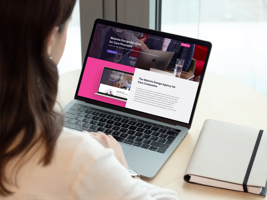
At Care Connect, we take all of these elements into consideration every time we design or update a care website. With our tailored website design services, your team can reach the families in need.
Turn Your Care Website Into Your Best Enquiry Tool
At Care Connect, every website we build is designed around one question: what does a family need to feel confident enough to reach out?
That question shapes every structural decision, every piece of content, every trust signal, and every CTA, from the first page a family lands on to the moment they pick up the phone or submit an enquiry.
We bring years of experience building care websites across the UK, combining sector knowledge with conversion-focused design to create websites that consistently deliver the right enquiries for the care businesses behind them.