
Why is my care website not getting enquiries?
It’s one of the most common frustrations care business owners bring to us, and the answer is rarely what they expect. The problem usually isn’t the content, the photography, or even the SEO. More often, it comes down to something far simpler: the way the website is designed to convert visitors into enquiries.
In this guide, we look at how UX and care website conversion rate optimisation, specifically button design, can be the difference between a website that generates enquiries and one that quietly lets families slip away.
Not sure if your website is converting as it should? Reach out to the Care Connect team today. We specialise in website design for care businesses across the UK, building sites that are professional, accessible, and designed to turn the right visitors into the right enquiries.

Is Your Care Website Failing to Convert?
Before assuming the problem is traffic, it’s worth asking a more fundamental question. Are the visitors you do have being given a clear, easy, confidence-inspiring reason to get in touch?
Traffic vs. Conversion
A traffic problem means not enough people are finding your website. A conversion problem means people are arriving but leaving without making contact.
Knowing which one you’re dealing with changes everything about how you fix it. If your care website is receiving visitors but not converting well, the issue is almost certainly UX, not traffic.
Why Care Websites are Particularly Vulnerable
Families arriving at a care website are rarely browsing. They’re under pressure, emotionally stretched, and looking for reassurance. If your website is slow, hard to navigate, or unclear, they’ll leave.
In our experience working with care businesses across the UK, one of the most consistent causes of poor enquiry rates is the CTA button, or the absence of one, that actually works.
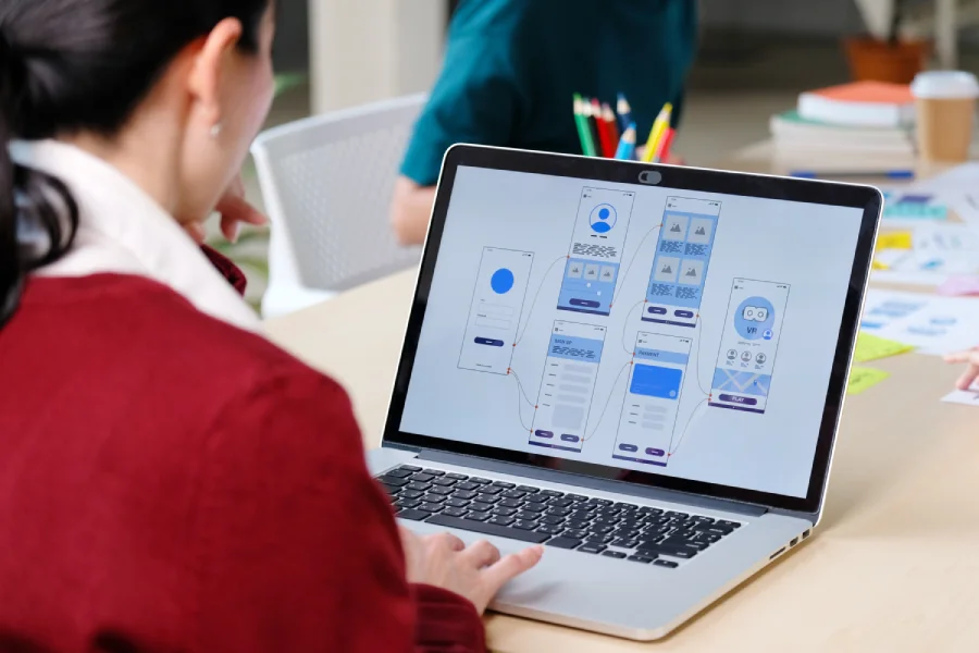
What UX Design for Care Websites Actually Means
UX, or user experience, gets used a lot, but it’s not always explained. For care businesses, it’s worth understanding because it directly affects whether families stay on your website or leave.
Design is what a visitor sees. UX is what they feel, how easy it is to find information, how quickly it loads, and how clearly it communicates what to do next.
At this moment, a website that requires effort adds friction at exactly the wrong time, and in fact, that friction has a cost. UX design for care websites needs to build confidence at every stage, not just at the point of enquiry.
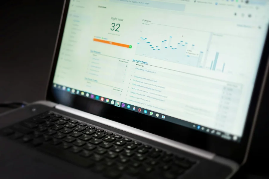
According to Google, 53% of mobile users abandon a website that takes longer than three seconds to load. For families searching for care, that’s not a technical detail; it’s a reason they don’t call.
The Role of CTA Buttons in Care Website Conversion Rate Optimisation
If UX is about how a website feels to use, a CTA, or call to action, button is where that feeling is tested. It’s the moment a visitor decides whether to take the next step or leave.
For care businesses, that next step is almost always an enquiry. CTA button design for healthcare websites is one of the most overlooked factors in whether that step gets taken, and one of the most impactful to get right.
- They Guide Families to act
Without a clear, visible prompt, families who are ready to reach out will hesitate, and hesitation in care frequently means they move on to the next provider.
- They Signal Confidence
A well-placed, clearly worded CTA tells a family exactly what happens next, reducing anxiety at a moment when they’re already under stress.
- They Directly Influence Conversion Rate
One survey found that personalised CTAs convert 202% better than generic ones. The language, placement, and design of your button is not a cosmetic decision; it’s a commercial one.
- They Reflect the Quality of Your Care
A confident, warm, and clearly worded CTA communicates something about your business before a family has even spoken to you. It’s a small detail with a big impact on first impressions.
At Care Connect, we design CTA buttons that work; clear, warm, and positioned to convert the right families at the right moment. With years of experience building digital marketing roadmaps for care businesses, we know what prompts families to act and what makes them hesitate.
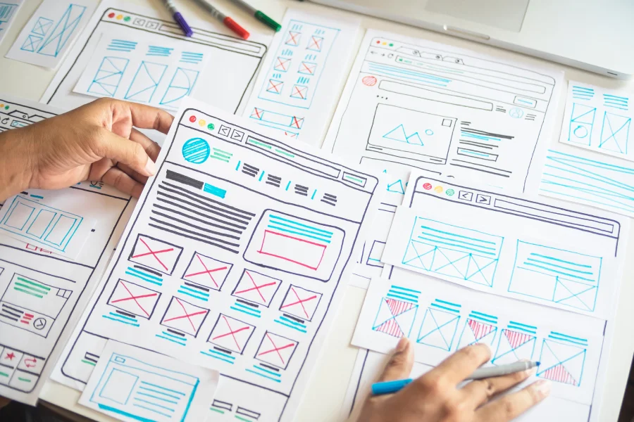
How to Improve Care Website Enquiries Through Better Button Design
Knowing that CTA buttons matter is one thing. Knowing what to do about them is another. Here are the specific design principles that make the biggest difference for care websites.
Placement
Your CTA button should appear above the fold, visible without scrolling, on every key page of your website. Families shouldn’t have to search for a way to contact you. If they do, most won’t.
Wording
Generic button copy like ‘Submit’ or ‘Click Here’ tells a family nothing about what happens next. Specific, action-oriented language works harder. ‘Book a Free Call,’ ‘Speak to our Team,’ or ‘Find out How we can Help’ are warmer, clearer, and more likely to convert.
Colour and Contrast
Your CTA button needs to stand out from the page. Not garish, but visually distinct, so that it’s easier to spot. In care, where pages often carry a lot of text and imagery, contrast is critical.
Size and Mobile Optimisation
Mobile-friendly design boosts patient call enquiries by around 32%. A button that works beautifully on a desktop but is too small to tap comfortably on a smartphone is losing enquiries every day.
Repetition Across the Page
On longer pages, a single CTA at the top isn’t enough. Repeating the button at natural pause points, after a key section or before the footer, keeps the next step visible without the family having to scroll back up.
At Care Connect, every website we build is designed with these principles at its core. We don’t apply generic web design rules to care businesses; we build sites around the specific way families search for, evaluate, and ultimately choose a care provider.

How Care Connect Approaches Website Design and UX
A care website that looks good but doesn’t generate enquiries isn’t doing its job. At Care Connect, we design websites specifically for care businesses, built around the way families actually move through a care decision.
Every design choice, from page structure to CTA placement, starts with the same question: what does a family need to feel confident enough to reach out?
Care website conversion rate optimisation is at the heart of everything we build. We understand the emotional weight of the decisions families are making, the trust signals that matter to a care audience, and what it takes to turn a website visitor into a genuine, well-matched enquiry.
Small Design Decisions, big Impact on Enquiries
The difference between a care website that generates enquiries and one that doesn’t is rarely dramatic. More often, it’s a CTA button that’s hard to find, wording that doesn’t reassure, or a form that asks too much too soon.
In care, small details have an outsized impact. A website that removes friction and builds confidence isn’t just good design, it’s good care marketing.
Care website conversion rate optimisation doesn’t have to be complicated; sometimes the biggest gains come from the smallest changes. At Care Connect, we build care websites that work as hard as the teams behind them.